Felix - Identity Development
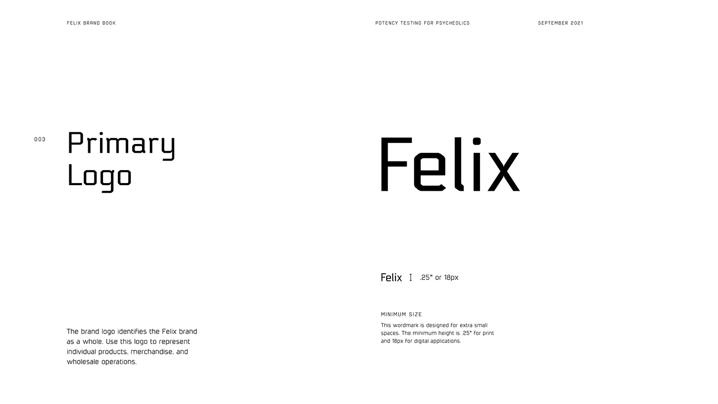
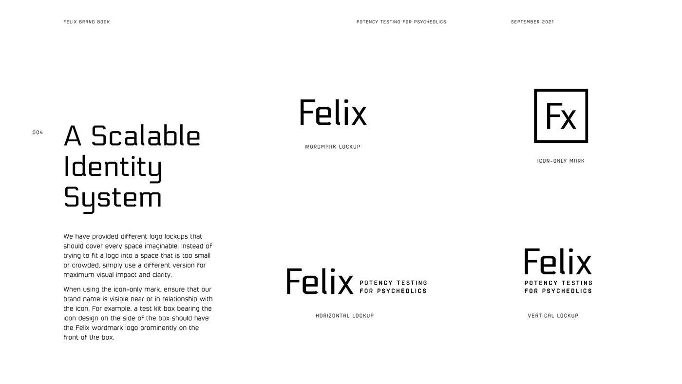
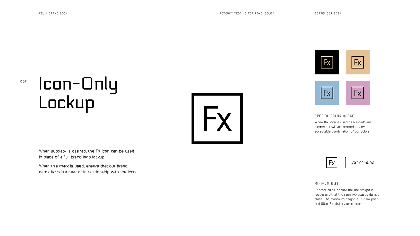
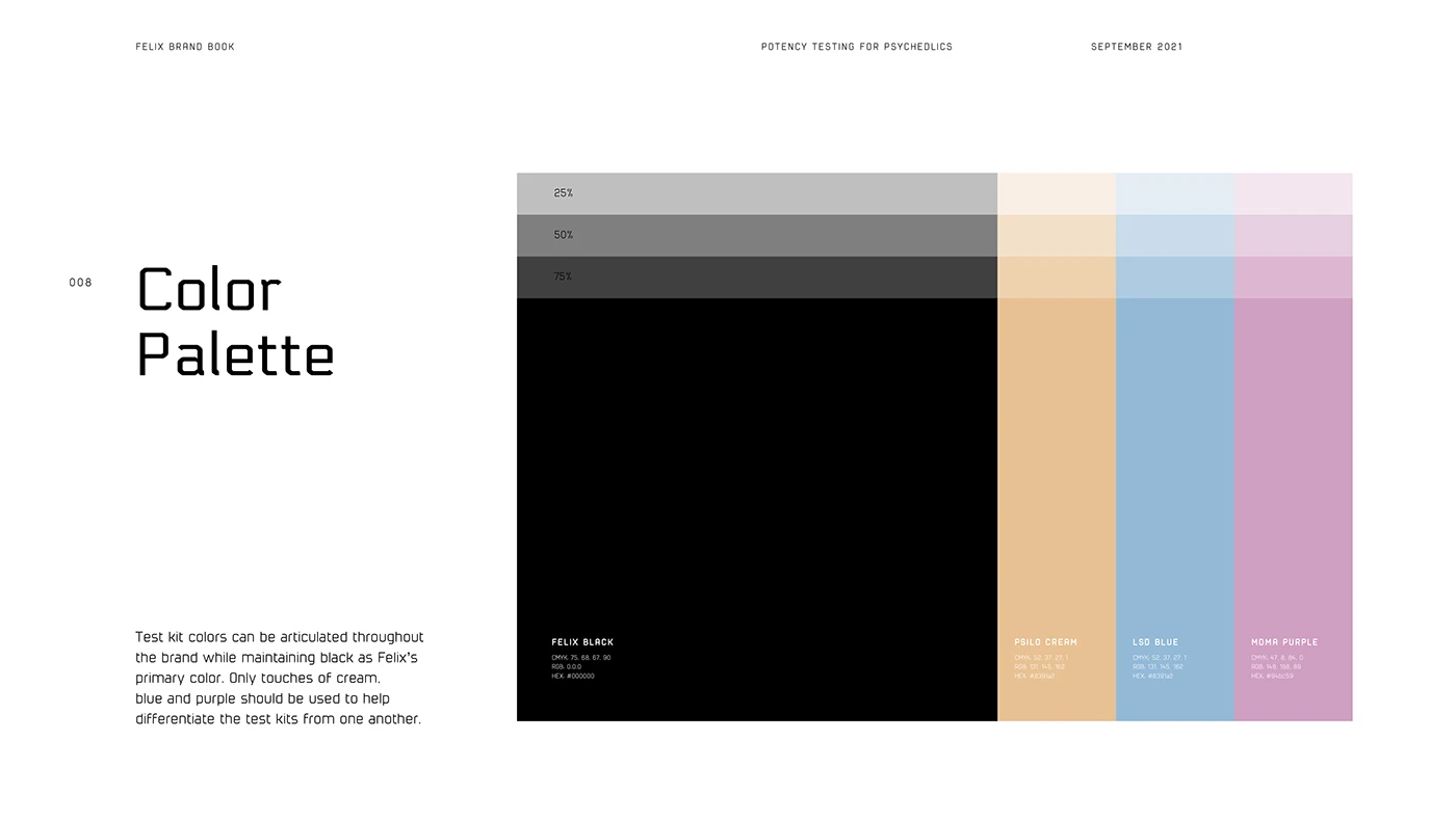
While other test kits on the market utilized branding geared towards a drug consuming aesthetic and stereotype, we wanted to associate ourselves with safety and scientific accuracy. Our choice of identity lends itself to mathematics and precision. Both the font and the brand mark utilize clean geometry, and the brand mark itself is a play on the elements found in the periodic table.
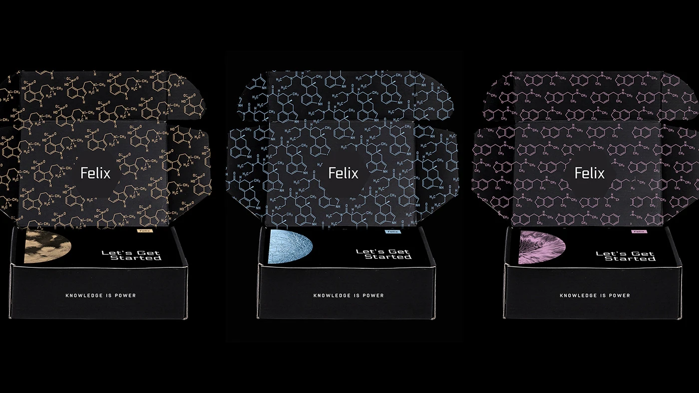
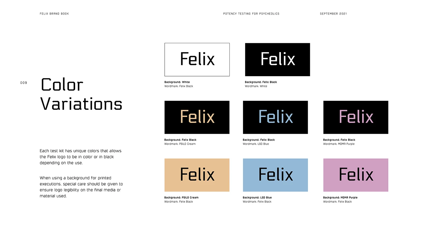
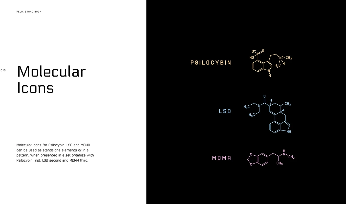
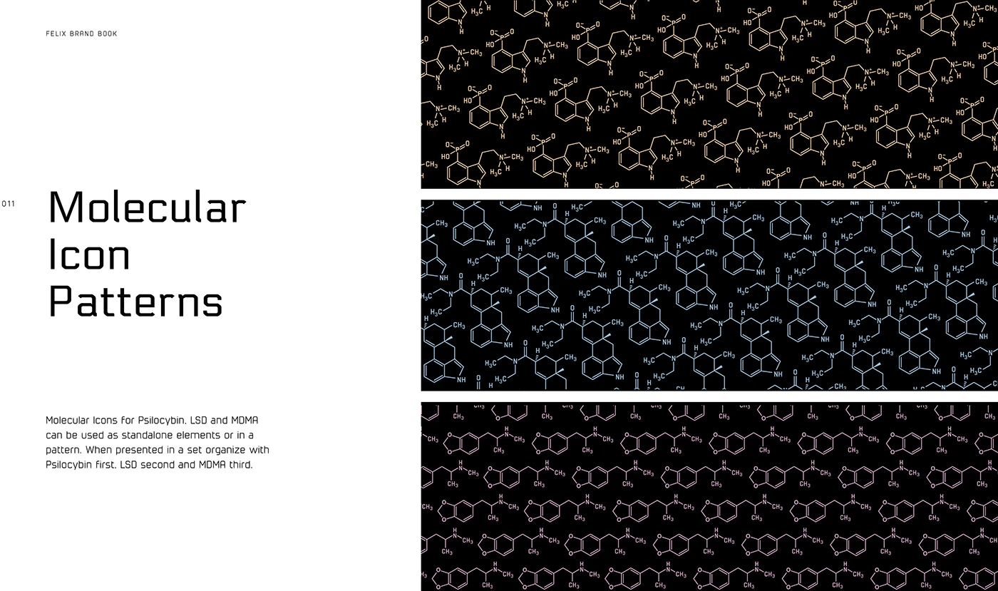
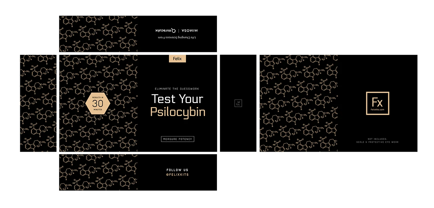
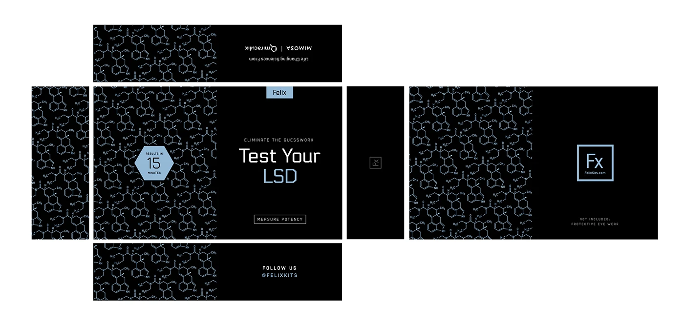
By utilizing the molecules being tested in the product itself, we were able to successfully extend the charm of our theme as well as core values we were striving to portray. This company is all about the science! The use of colors is a subtle nod to the LED culture present at raves and music festivals where these substances are commonly ingested. This further connects the product offering to the community using it.
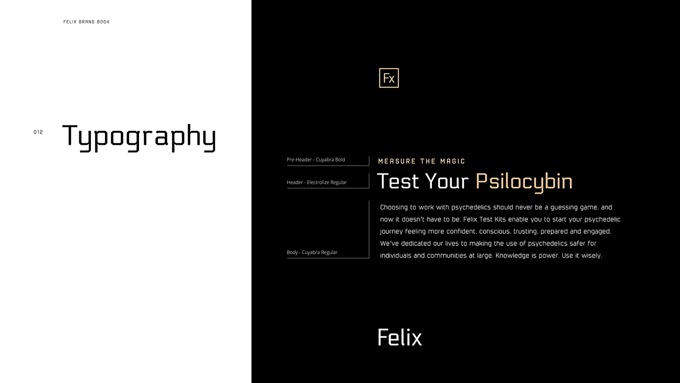
We created copy that was culturally relevant, informative, and straight to the point. Psilocybin is the psychoactive ingredient responsible for its consumers engaging in psychedelic and mystical experiences. The mushrooms home to these substances are commonly referred to as "Magic Mushrooms." Our subtitle, "Measure The Magic" is a playful way of helping our consumers understand the purpose of the product offering, while simultaneously creating excitement about the benefits of the product. The title, "Test Your Psilocybin" tells you exactly what the product does. This is important for both SEO and the instant comprehension we were seeking to achieve. The paragraph below the title gives the reader a more complete understanding of the benefits and problems being solved by the offering.
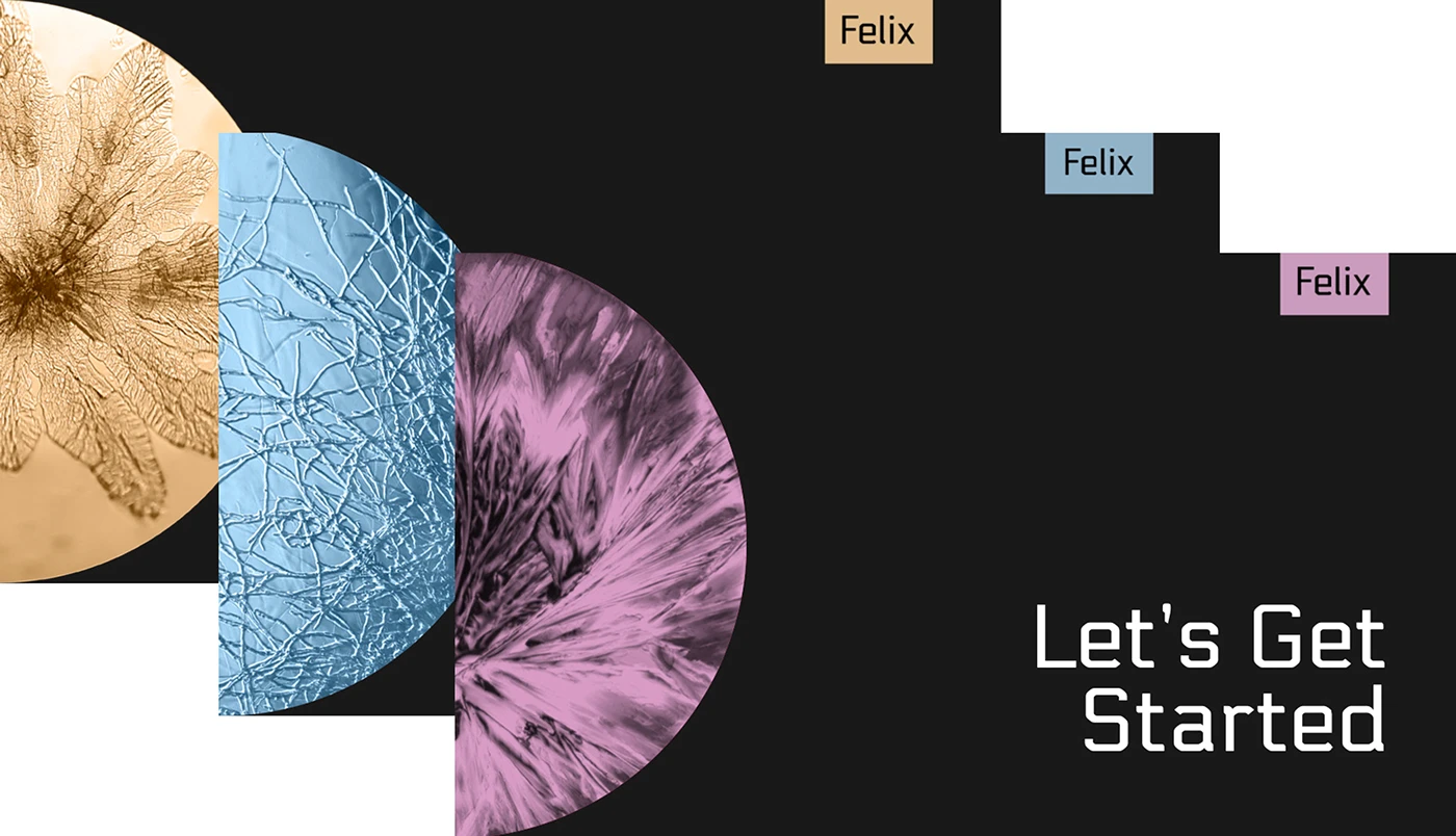
Above are three separate instructional pamphlets that went into each individual test kit. As you can see, we kept the color themes coordinated for each kit so that they would each have their own unique identity within our branding ecosystem. Inside these pamphlets we created a series of icons to accompany the explanations for how to use the test kit.
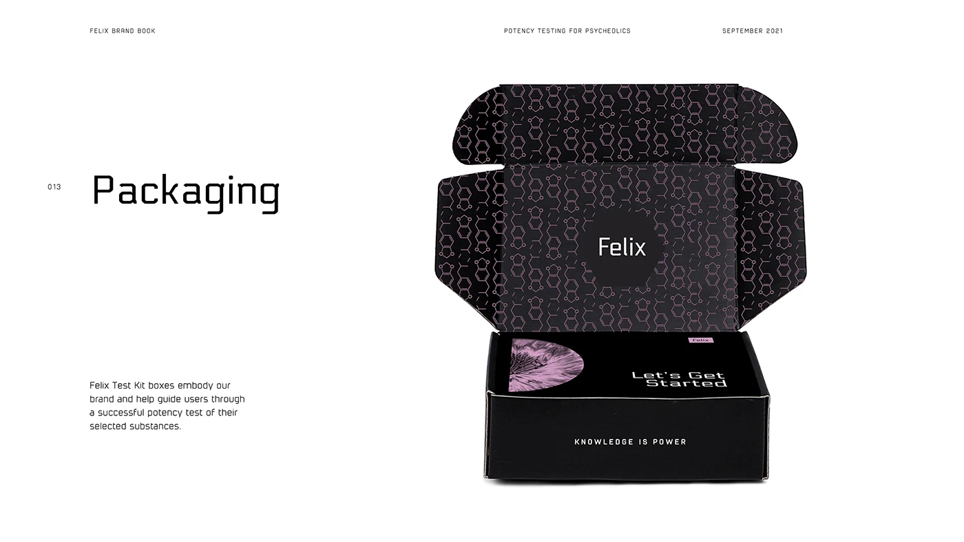
We achieved a packaging aesthetic that is sharp, slick, smart, and on point with the culture. This packaging design and copy choice also reinforces the company values. Our style was developed to stand out on shelves and look great for online sales. In addition to the design, we also sourced the boxes, and provided both local and international supply options.
Unfortunately, the company who hired us to develop this identity was way ahead of its time in regards to the laws and regulations in place preventing its public appearance in the United States.
Images and text © Jonathan Keim, from Behance.
NEXT WORK