Kokolato
Vegan coconut-cream gelato from Bali. Plant-based indulgence, perfected for the scoop and the table.

01Context
Kokolato is a brand of raw coconut-cream gelato that I invented on the island of Bali, Indonesia, in 2014. At its peak it was served in about 25 locations around the island. It is also the brand that helped me discover my passion for creative direction. In 2019 I officially rebranded it, and in 2026 I rebuilt the website.
02The problem
Plant-based desserts are often sold on what they leave out. Kokolato needed to sell on pleasure: avant-garde, luxurious, artistic and playful, not "free-from".
03Archetypes
Innocent
Simple, clean ingredients.
Lover
Indulgence without compromise.
Voice: Joyful · Clean · Indulgent
04Primary / secondary colors and fonts
#000000#1A1617#D9D9D9#FFFFFFAa Bb Cc
The quick brown fox jumps over the lazy dog.
A neutral sans so the product photography leads.
05Logo
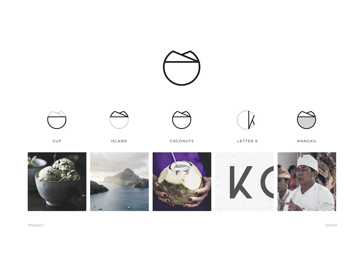
The 2019 logo holds the key parts of the gelato experience: the cup that holds the gelato, the island where it was invented, the coconut it is made from, the "K" for Kokolato, and a symbol for the Mangku, the Balinese priest who blessed all our coconuts. The 2026 site keeps that logo rather than redrawing it.
06Visual system
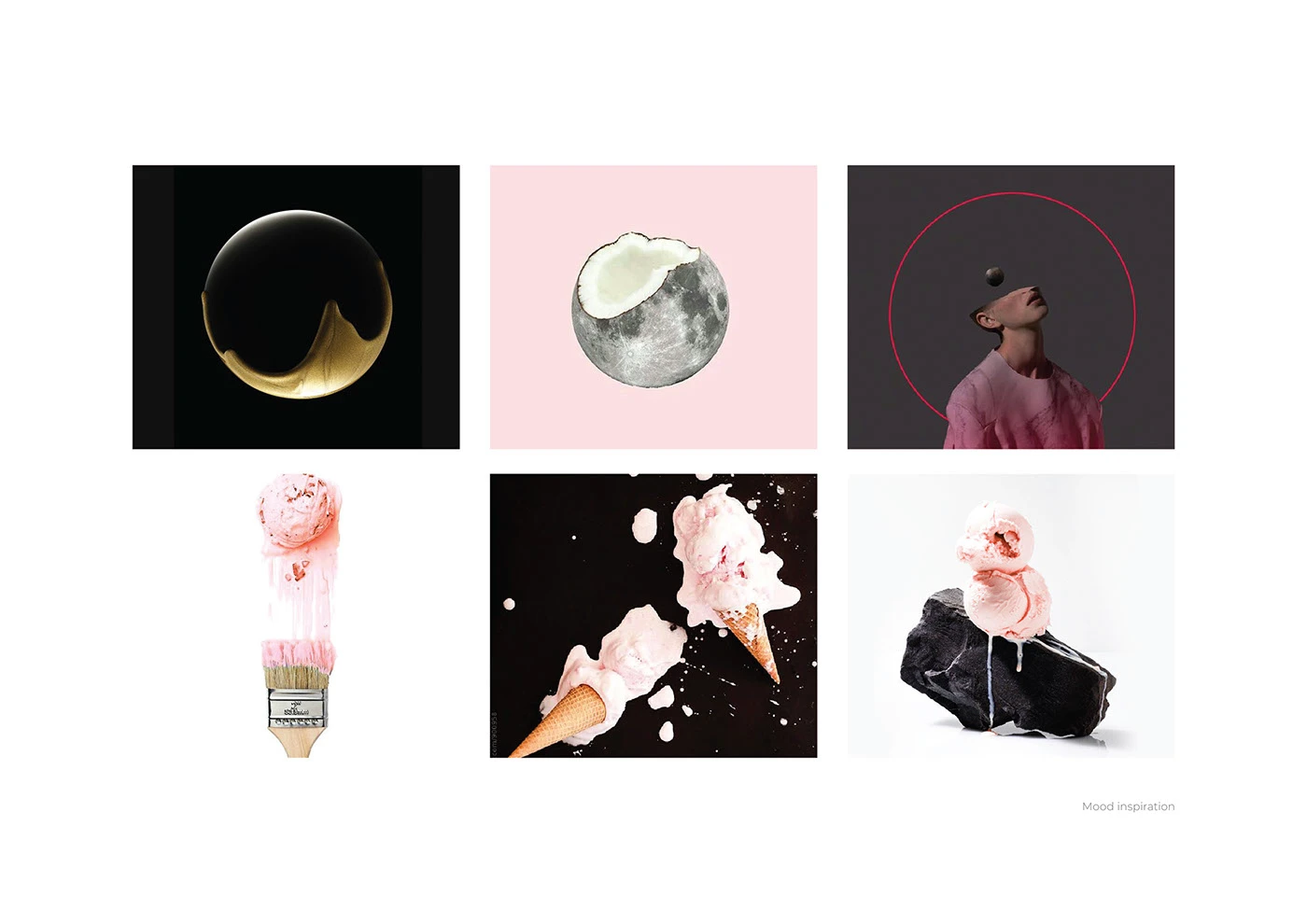
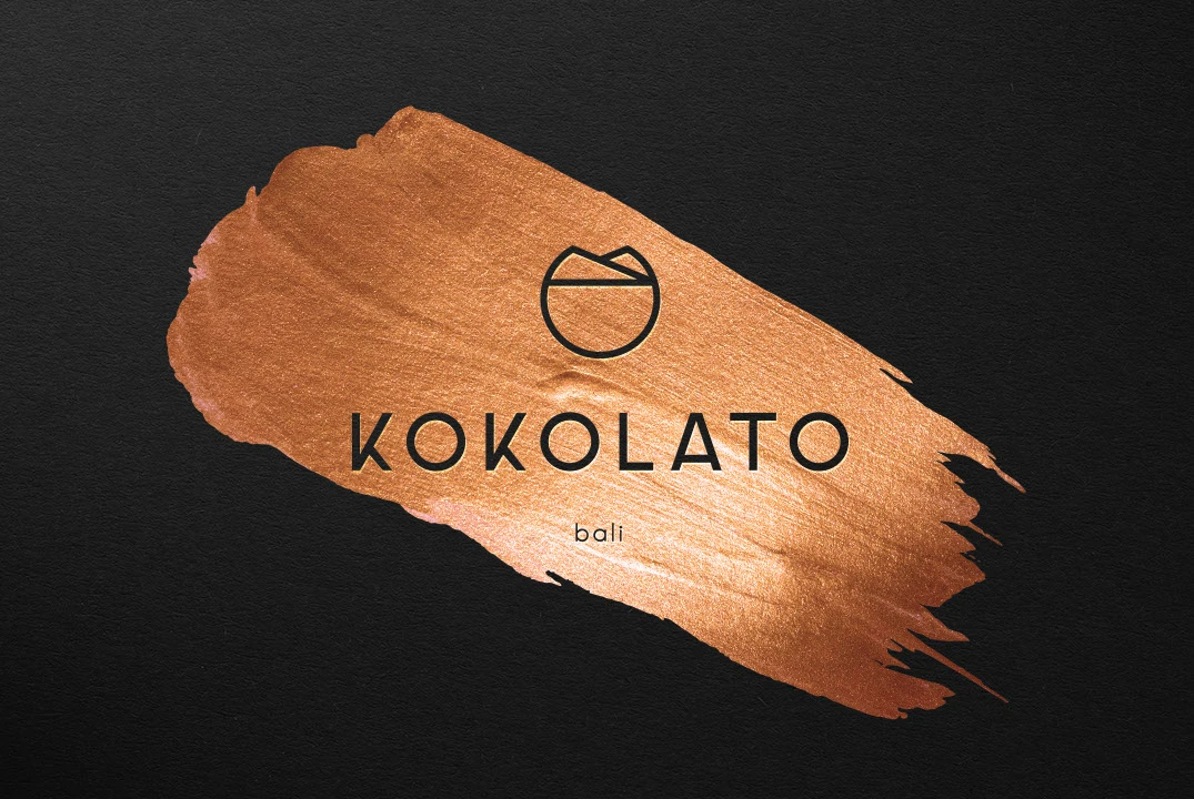
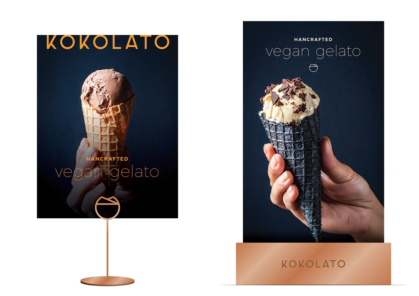
The 2019 rebrand started from a mood board for an avant-garde, luxurious, artistic and playful feel. Gelato was photographed on black to make it feel sophisticated, with copper brush strokes, circle-based packaging concepts and patterns built for menus, posters and shop walls. The 2026 site carries that through in black and white, so the gelato is the only colour on the page.
07Design decisions
Gelato photographed on black
over bright dessert-shop photography, because it added the sophisticated, luxurious feel the brand was striving for.
One logo with five stories in it
over a plain wordmark, because the cup, island, coconut, "K" and Mangku symbol tell where the gelato comes from.
Black-and-white layout on the 2026 site
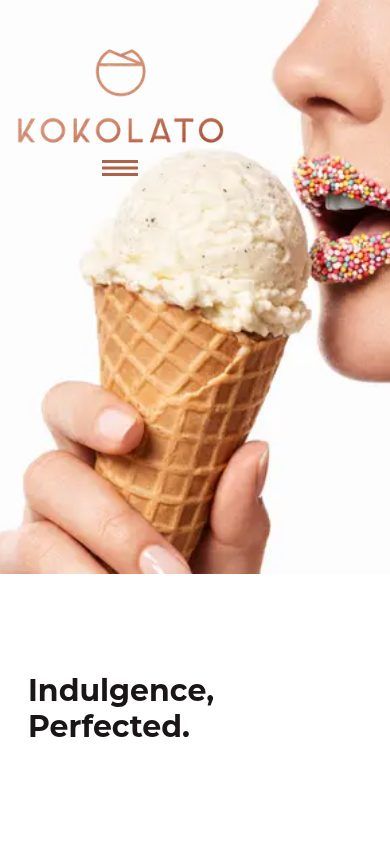
over pastel dessert colours, because it makes the gelato the only colour on the page.
08Final product
09Live site
On a wide screen, scroll the live site inside the laptop. The page, and its animations, run as they do on the real site. On a phone, open the live site with the link under the laptop.

Visit the live site →Open kokolato.com to scroll the live page and its animations.